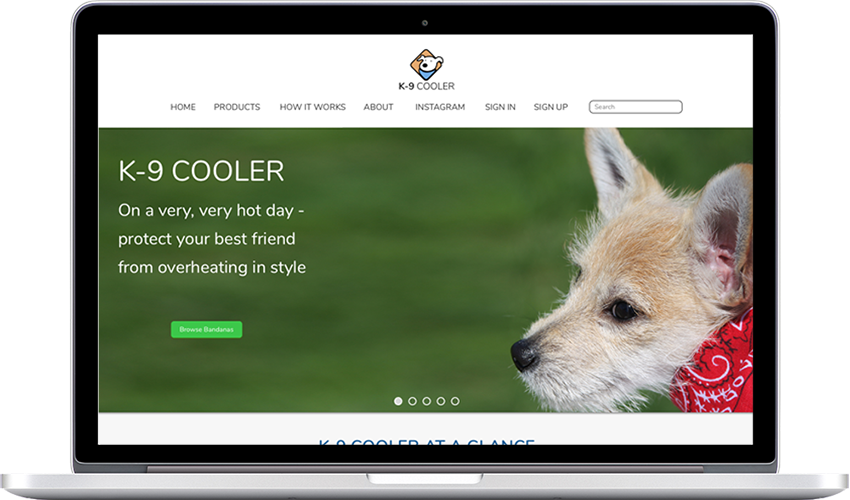
Dogs are our family for many of us. As they cannot sweat like human, hot weather can be really tough for them. K-9 Cooler is a new product to remedy exactly that - a dog bandana with a hidden pocket to insert an ice pack.
deliverables: Responsive Web Design to Showcase a New Product
MY ROLE: UX Design, UI Design, Branding
TOOLS: AI, PS, Draw.io, Balsamiq, Sketch, Google Suite, UsabilityHub, InVision
Dogs used to live where the climate was suitable for them. Malamutes were in Alaska and Chihuahuas were in Mexico. But it is no longer the case. You'd find a whippet in New England or Great Pyrenees in the Southwest. Since dogs cannot sweat, the heat can be life-threatening for them. How do we keep them safe and happy while walking them on a very hot day?
Entered K-9 Cooler, a dog bandana with a hidden pocket for an ice pack. It secures the ice pack near the dog's artery and cools down the blood circulation to keep your pup from overheating.
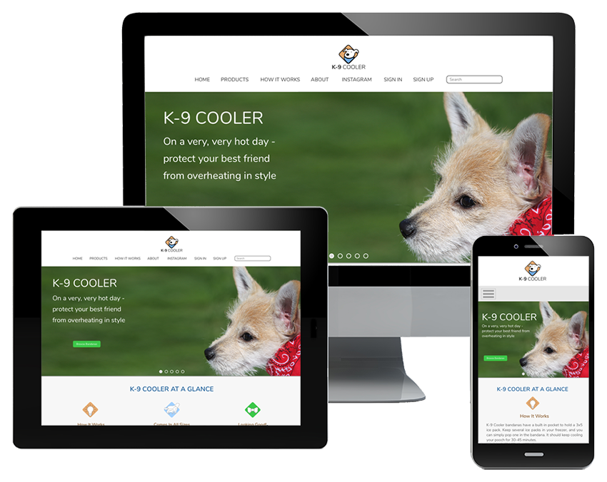
The main goal of the project was to build a responsive website to showcase this new product for dogs. It did not have to be over complicated as it featured one product, but it needed to show the different fabric patterns available in the product line. So placed the images of fabric in squares on the home page, as well as the product landing page. Each fabric image linked to an individual product page, where the customers can pick the size and quantity for easy order submission.
The branding process started with sketches for the logo. It was essential for the brand to have a personable and playful look and feel to appeal to dog owners since the product was for dogs. It as also important not to use an illustration that looked too much like a specific breed as the line catered to all breeds big and small. So I developed three designs, one purely geometric and the others more cartoony.
I conducted a user testing with those final designs, and the top two had almost split decisions. But the winner got more votes on the second test. And I finalized the design with it as the testers gave the comments like:
"It looks cuter as a pet product logo should look"
"Looked more play and dogs are playful"
"Simplest yet still clear"
I created two color palettes with shades of browns (for dog's coat colors) and blues (for the cool water and the gel in the ice pack). One of them was clearly favored on the user test (72%). I tried both palettes with the winner logo, and the blues in the winner was a little less glaring while the light brown was a little brighter, so I made a decision to use that one. The comment on the other palette pointed out that green stands out more for call-to-action buttons, so I added it to the final color palette to be used as the accent color.
While I was researching on the websites of pet industry from large chains to specialty boutiques, the trend in the font-use was sans-serif with round details. So I picked Nunito typefaces for its round corners. It was functional, yet it didn't take it too seriously - overall it was suitable for the product.
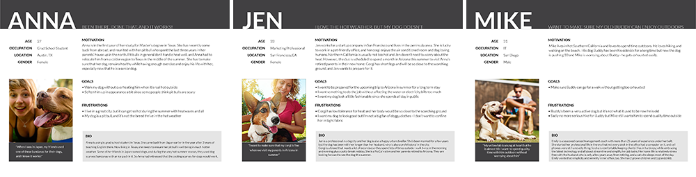
The dog owners who'd need K-9 Cooler fell into at least one of the followings:
Using those basic criteria, I created three personas. Anna moved to Texas with her pit bull who spent the past few years in the much cooler area. Jen's corgi could get too close to the scorching asphalt during summer. And Mike wanted to make sure his old lab wouldn't be too exhausted.
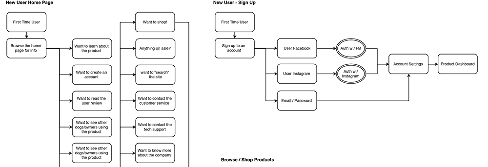
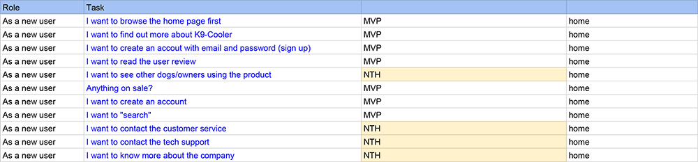
Based on the requirements and the work completed thus far, I created the user stories for new and returning users, each classified as MVP, or nice-to-haves. User flows were created to describe each situation the users would encounter, from the first visit as a new user, onboarding, to the purchasing process.
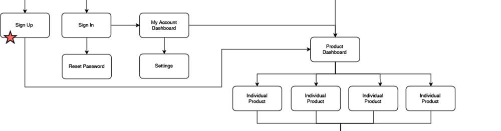
The site was simple in structure but there were a few routes to the purchasing stage, and the sitemap diagram would help me throughout the process.
In the lofi version wireframes, I created two versions of the homepage, product landing page, and individual product page. Reflecting a preference test, I picked one set to move onto the hifi wireframing stage.
In the hifi version, I tested two layouts of the individual product page. The contents were identical but the text/picture placement was opposite. The version with the pictures on the right got more votes and I moved onto the mockup stage using that layout.
Now that the page designs were finalized, I created the color mockups.
Examples are shown below.
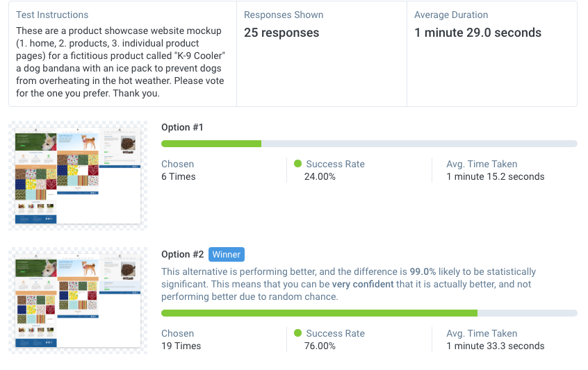
I tested two layouts that were identical in overall structure. The only difference was the gaps between the fabric pictures, and my objective was to find out how a subtle difference would affect the user experience.
The version with the white space between the pictures got a majority vote at 76%. One of the tester comments summed up the difference, and I made a decision to go with this option.
"I like the extra space between the images. While the other one is nice, it just feels like there is too much going on. This one feels more approachable and easier to look at in chunks"
This project gave me the valuable lessons of test early and test often. From logos to colors to the tiny details of the layout, you don't always see the best choice or the right choice because as the creator of each element, you are too close to the material and not capable of reviewing - exactly why you need many sets of fresh eyes.
Same as all other projects, I would like to expand the design and coding to the entire website had I had more time.