GSRNC (German Shepherd Rescue in Northern California) is an NPO to rescue/foster/adopt German shepherd dogs in Northern California. In the past 16 years, they have successfully placed over 4000 dogs to their forever homes.
The project is to give the organization’s website a complete makeover.
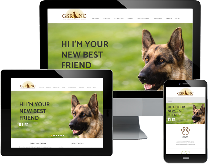
deliverables: Responsive Web Design
MY ROLE: UX Design, UI Design, Branding
TOOLS: AI, PS, Draw.io, Balsamiq, Sketch, Google Suite, UsabilityHub, InVision
GSRNC is in successful operation for 16 years. The organization website is the primary point of contact for many potential volunteers and adopters, but the contents are not organized in the optimal way that the site has evolved and added its contents over time.
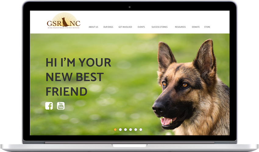
Also, the website is not responsive. Laptops are the primary devices to view the site at the adoption and fundraising events. Currently, it requires more clicks than you should have to. Smartphones are the device of choice in other settings such as a meet-and-greet with adopters - they have to navigate through the full-size website shrunk to a much smaller screen size to call up the dog’s information.
My responsibilities on the project are to 1. reorganize the pages/contents for better user experience, and 2. excecute the complete UI makeover to transform the site into a responsive one.
These arer the major tasks to revamp the site. The new layout using grids to construct the pages to be responsive. Reduced text volume wherever possible and introduced icons to achieve cleaner look and easier navigation. The mostly-white-background to have the most important elements - the dog pictures / information - to stand out. Inspected the entire site to assess the information hierarchy to reorganize the pages and sections to improve the user experience.
While I had a good ideas about what to keep and what needed improvement, I conducted a user survey to better understand the prespective of users. As I expected, laptops and smartphones are the go to divices for majority of the users.Interesting finding was that 2/3 people thought it was easy to use the site, yet 90% of the same group of people thought the page design for smartphones could use some improvement (and 30% thought the same for the desktop design).
From what I can see in the survey results, it was easy to nagivate through the site for the current volunteers as they use the site all the time. It was also not partifularly difficult for the first time users because so many websites out there were still not responsive and people simply knew the way to intuitively work through it.
So it was not broken, but it was time to reinvent the wheel as the majority thought the design should be improved.
75%
View the site on a smartphone and/or laptop (multiple answers)
66%
Find it easy to navigate the current site mainly because they use it often while others think it can be difficult at times to use the site
90%
Think page layouts on smartphone can be improved while 30% of them also think the pages on desktop can be better
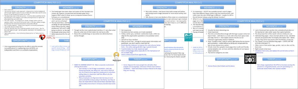
To better understand the industry, SWOT analysis was conducted on rescue organizations in the same geographic area:
Based on the SWOT analysis results, the following categories were to be the main areas of focus on this project:
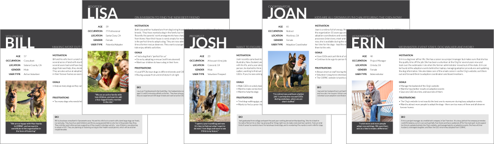
Based on the user research and additional interviews with the existing volunteers, I created 5 personas to represent different types of users. Two types of prospects (wants to volunteer, wants to adopt a dog), and three types of active volunteers who take up different roles.
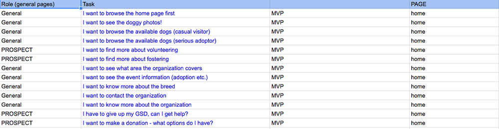
User stories were created for each persona (adopter, prospect...), and organized in two categories (MVPs and nice-to-haves).
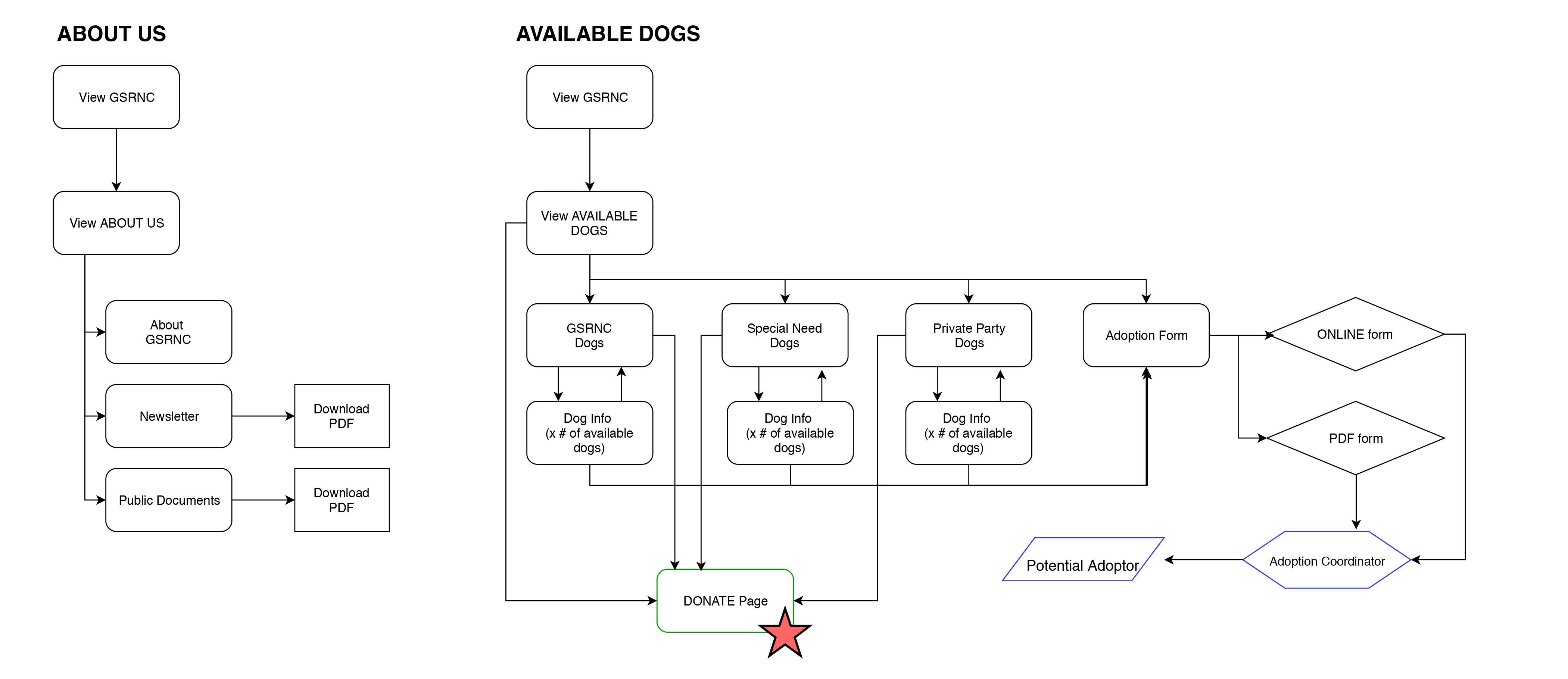
I created detailed diagrams. It was to show how users would operate on different sections of the site, as well as to determine the simpliest page structures for the site.
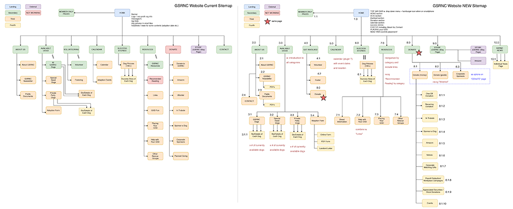
I created two sitemaps. The current map (left) to determine where in the structure to be improved, and the new map (right). There are no huge differences in overall structures between the current and the new, but I cleaned up the second level pages to give it an easier to follow structure across the board. I also simplified the Donate and Resources sections for simpler navigation.
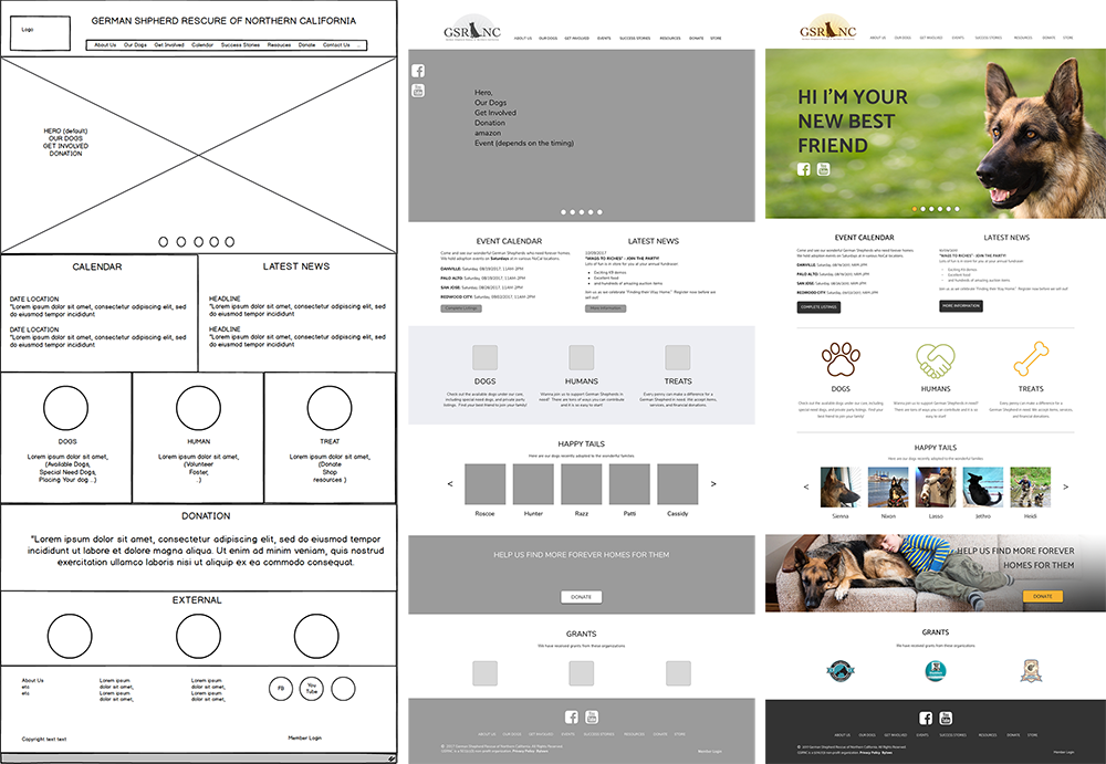
Lofi (Balsamiq) and hifi (Sketch) wireframes were created in several iterations to determine effective page layouts. I created 3 options of home page. One with a balanced mixture of picture/text, while the other two were hearvily picture oriented (text would show when hovering on a picture). A preference test favored the option #1, and created more layouts for the second and third level pages.
At this stage I started collecting icons and additional pictures from stock photography and the existing organizatoin site.
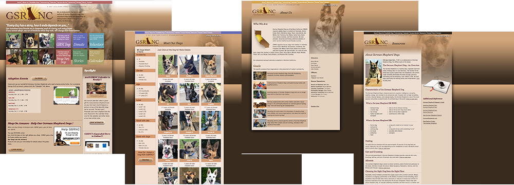
I applied colors, pictues, and icons on the layout to create mockups. Once it was finalized, the pages were inported into InVision to set up the clickable prototype.
Examples are shown below.
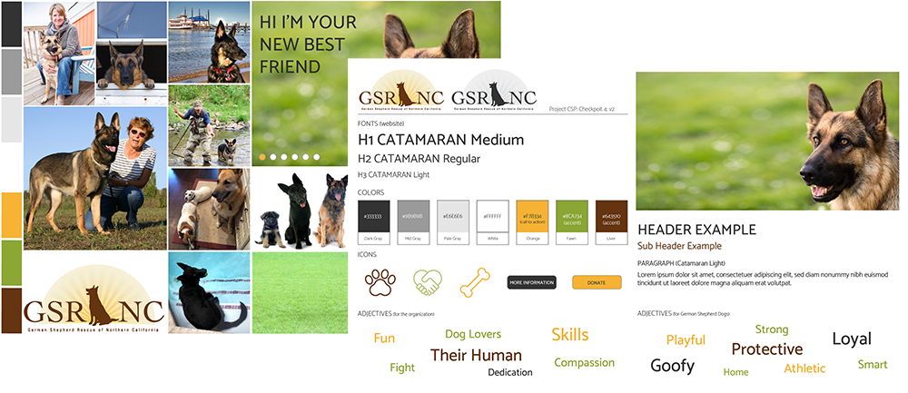
There was no change on the existing logo at this makeover, so my task was to choose the new color palette, and typefaces.
The site featured the variety of pictures and it was important to enhance them, so monochromatic tones of black, white and gray were selected as main colors. For highlights, I picked orange (for German Shepherd dog's amber eyes), muted green (for grasses they are running on), and brown (for their coat color).
I selected Catamaran typefaces. It was important for the site to be approachable to attract viewers but I wanted to avoid it to look too cute as the organization specialized in the breed that was often associated with law enforcement agencies and military organizations (coinsidentally many of volunteers and adopters have such backgrounds).
So I researched websites of police departments and military organizations such as US Army, SFPD, and FBI, and concluded that an appropriate choice would be sans-serif that was not too round. Catamaran fitted those criteria while it did not look too standard or office-y with its slanted corners and non-generic looking numbers and symbols (as in "&" mark).
Going into the project the challenge I expected to happen was a reorganization of existing information as the site contained quite a lot. Another challenge I thought of was how to create an effective website for multiple user groups with different needs (adopter, prospect, and active volunteer). But adhering to the UX/UI processes kept me on course to divide and conquer each step (thank you personas user flows and sitemaps!).
The curveball the project threw at me was how tricky it was to come up with 50+ icons that were appropriate for each category yet clearly different from each other. I was glad that I had gone through this process as it gave me an opportunity to examine each category from different angles to come up with the icons that felt right.
The lesson I've known but have re-learned during the project was the importance of a solid foundation. By putting time and effort to build the accurate-as-possible wireframes and mockups in at least a few different options, it is much easier to work on more details in prototype and coding stage.
One thing I would change if I had more time: I would've built the complete clickable prototype and the actual website for every page in the site.