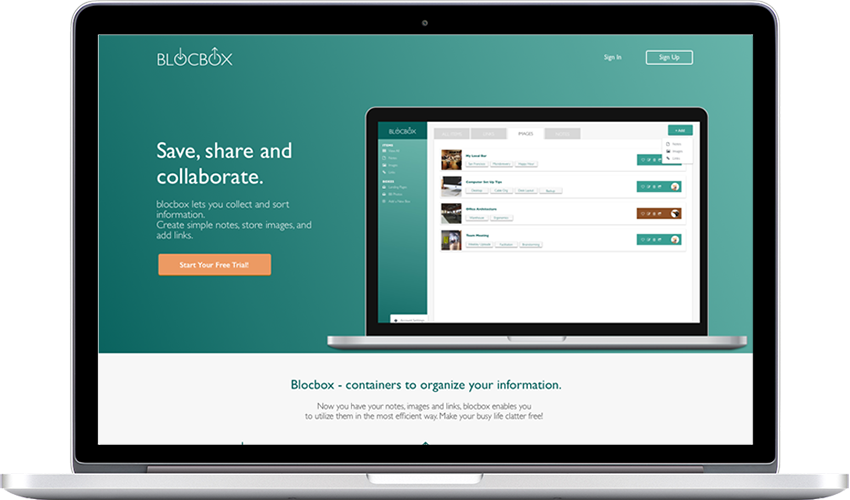
Blocbox is a web-based service to let you collect, organize and share your links, pictures, and notes. The project is to build the landing page, sign in/sign up pages, and the dashboard page of the site.
deliverables: Alternative Interface Design for an App
MY ROLE: UX Design, UI Design, Brand Identity
TOOLS: AI, PS, Draw.io, Balsamiq, Sketch, Google Suite, UsabilityHub, InVision
It's been a while since we saw someone with a cellphone that was not a smartphone. Chances are, we have at least two computer devices at our disposal (it multiplies if you live with your family). It's also been a norm to share digital assets with friends and coworkers to collaborate on a project.
So what should we do with the multiple copies of the same file? Version control issues? A link saved on your phone but not on your computer? We need a simple, all-in-one solution.
Blocbox lets you save, share and collaborate on a simple platform, whether you are working on multiple devices alone, or working in a large group. It's not a super-powered network with tons of big data, but it makes your life easier. It is a simple app you'd use real quick to organize your busy life.
Users can simply type, or drag-and-drop the items they want to add to the dashboard, where they can see their own items, as well as the collaborators' stuff. They can have multiple "box" - a compartment to be assigned to different circles the users belong (i.e. family, work, volunteer...)
The overwhelming majority of the survey respondents own at least two computer devices - while everyone had a smartphone, 90% of the same group own a laptop, 80% the tablet, and 50% also own a desktop. And most of the people would save things they were interested and they would use (30% regularly and 60% sometimes) "Easy-to-use" is the key for the task, and 66% of them use a smartphone app and 22% use a desktop app.
100%
of the respondents own a smartphone.
90%
of the respondents who save the links and images that interests them
88%
answered that they'd use an app to write and keep notes
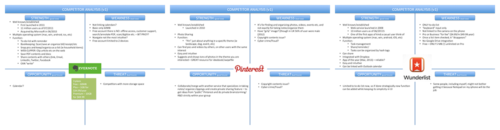
An analysis of market competitors (Pinterest, Evernote, and Wunderlist) found that they tend to specialize in something. Evernote's note-taking interfaces are great while Pinterest is the leader when it comes to search-and-save the pictures. For URL saving, there are bookmark apps for that. Blackbox's niche is there - providing an easy solution that works for "all of the above." Because currently, content-saving apps don't have strong URL saving functions.
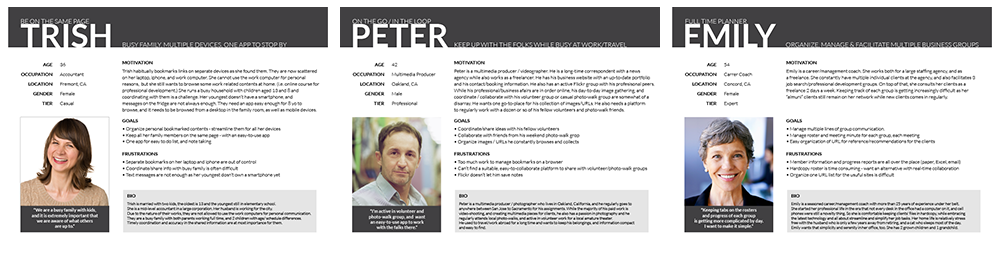
Three personas for the project represents the most likely users of the app that fall into different capacities. Trish uses it to sync things between her family members, while Peter needs it to keep up with friends to collaborate. Emily uses it professionally to organize multiple client groups where members constantly come and go.
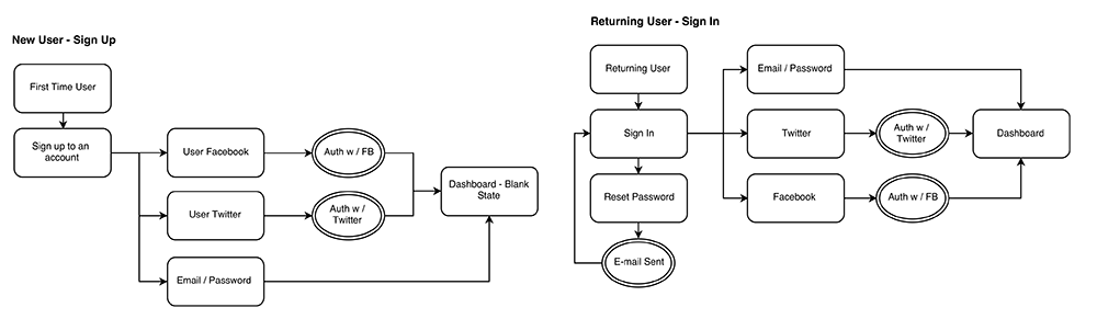
User flows to depict their movements in different paths were created for new and returning users for onboarding, signing, and sharing.
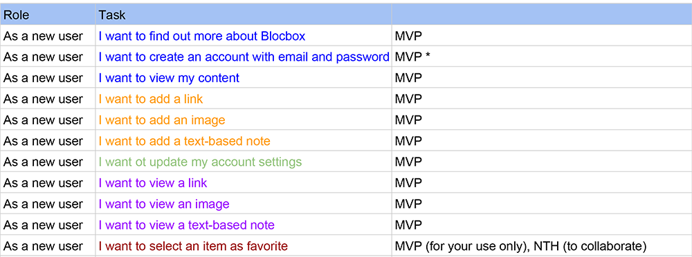
User stories were compiled to make each movement clear for new, and recurring uses.
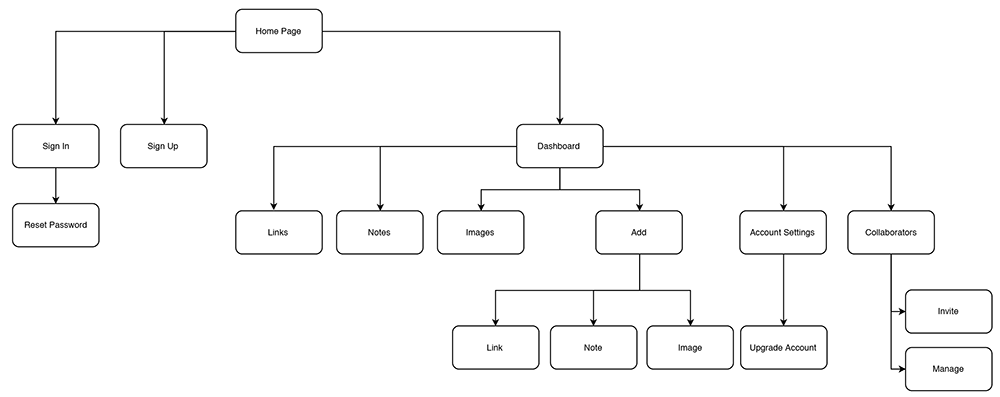
The sitemap is relatively simple as the site structure is not very intricate, but it's still an important tool to keep a clear bird's eye view of the project.
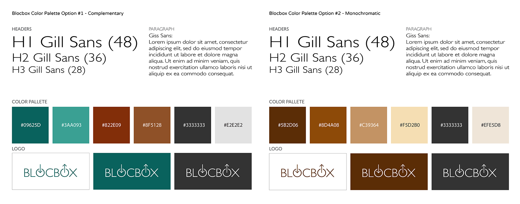
The first option I made was the complementary color palette with deep teal color. The first thought was that I like the shade, but a research showed me that teal (a mix between blue and green) represents open communication and clarity of thought - these are good associations for the app to jot down your thoughts and communicate/collaborate with others.
The second option was the monochromatic colors in shades of browns. While the main images of brown are earth, wood, nature etc, it is also associated with dependability and reliability and it is a good image to have for an app to organize your favorites and small bits of your everyday life.
A preference test gave me a lopsided result that favored the teal palette and I had set the rest of the process with this palette.
I picked Gill Sans for the project because it was a humanist sans-serif. Meaning that it had the roots in calligraphic, hand-crafted typefaces and I liked the idea of human hands' presence' since Blocbox was an app to collect notes, links, and images like an old-fashioned sketchbook/idea book.
The Blocbox logo underwent many sketch iterations until a handful of better sketches were recreated in Illustrator. The winner is the one shown above. It was chosen for its simplicity. Arrows in and out of the two "O" in the logo represent the pieces of collected items saved and utilized on one simple platform.
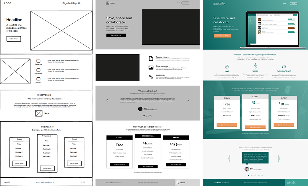
Through the two wireframe stages, I worked on two homepage designs to assess the options. After a few iterations and a preference survey, I finalized the design with the hybrid of the two.
With the branding finalized, I moved onto producing mockups. Once the static page images were finalized, they were integrated into the clickable mockup for demonstration purposes.
Examples are shown below.
Once the clickable prototype was compiled, I conducted the final user testing. Out of 25 respondents, everyone said the site looked trustworthy (though some of them commented that it was a bit boring... not much you can do when your deliberate choice was to go simple). 21 of 25 people rated the quality of page 4 or 5 on a 1-5 scale.
Though it took many drafts and iterations, the project goal, to create an app to provide users a quick and easy idea gathering and sharing experiences, was achieved. The testers found it was trustworthy and clean looking. A confirmation that the users' overall experience with the app was positive.
There are a few things I would like to change had I had more time. The first would be to expand the clickable prototype by creating all the required pages on the site. Another one was more thorough testing and interviewing since I relied on casual user feedbacks on smaller tests on the project.